Howdy, Stranger!

It looks like you're new here. Sign in or register to get started.

Options

R.I.P., Golden Age Artist Bob Lubbers

Bob Lubbers isn’t particularly well known these days, but he was a very good and versatile artist, and at one time his work was seen by more people than any of today’s artists. He got his start in comics in 1940 at the age of 18 with Centaur, where he worked until his career was interrupted by World War II. After the war, he joined the staff of Fiction House as art director and drew many of their biggest features, such as “Firehair” and “Senorita Rio”, as well as many covers.

But he left comics in 1950 for the “respectable” world of newspaper strips, Tarzan being his first job. He stayed on the strip for four years, then joined Al Capp’s studio for a time. Over the years he worked on several strips, most notably Big Ben Bolt, Secret Agent X-9, and Li’l Abner. He even did a few jobs for Marvel in the late ’70s.

Here are a few samples of his comic book art:

Original art for a “Firehair” story.

image

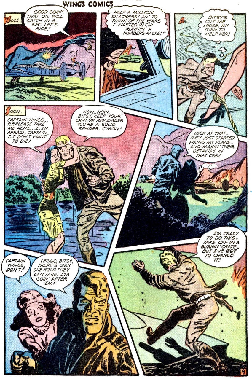
A “Captain Wings” page from Wings Comics #82 (1947). Lubbers had a tendency to use oddly shaped panels. It can make the page a little confusing at times, but it certainly gets your attention.

image


The cover to Wings Comics #105.

image

Comments

  • Options
    nweathingtonnweathington Posts: 6,741
    Here are some samples of his newspaper strip work:

    image

    image

    Robin Malone wasn’t a great success, running from 1967-70, but Lubbers created it all on his own, and it’s something of a cult classic. Below are a few Sundays.

    image

    image

    image


  • Options
    bralinatorbralinator Posts: 5,967
    Great cover. Another fine artist lost.
  • Options
    nweathingtonnweathington Posts: 6,741
    edited July 2017
    I'm partial to panel six of the “Captain Wings” page. Fantastic expressions, great composition of the figures, beautiful execution of the foreshortening of the woman’s arm, the lighting in the inks... and the coloring just puts the icing on the cake. It’s just a perfect panel, and the kind of thing you don’t see much of in today’s comics.
  • Options
    phansfordphansford Posts: 221
    The Wings and Firehair pages have a very Caniff vibe to them.
  • Options
    nweathingtonnweathington Posts: 6,741
    phansford said:

    The Wings and Firehair pages have a very Caniff vibe to them.

    Yeah, I think Lubbers was naturally a bit more cartoony than Caniff, but Caniff was the standard when it came to the adventure genre in the ’30s and ’40s. Lubbers changed his style to fit the job, so when he was doing adventure stories, he naturally emulated Caniff.
  • Options
    WetRatsWetRats Posts: 6,314

    Here are some samples of his newspaper strip work:

    image

    image

    Robin Malone wasn’t a great success, running from 1967-70, but Lubbers created it all on his own, and it’s something of a cult classic. Below are a few Sundays.

    image

    image

    image

    Did every strip have somebody on the phone?
  • Options
    WetRatsWetRats Posts: 6,314
    I love his funky layouts!
  • Options
    nweathingtonnweathington Posts: 6,741
    WetRats said:

    Here are some samples of his newspaper strip work:

    image

    image

    Robin Malone wasn’t a great success, running from 1967-70, but Lubbers created it all on his own, and it’s something of a cult classic. Below are a few Sundays.

    image

    image

    image

    Did every strip have somebody on the phone?
    Ha! No, but these were some of the few I could find online at a decent res.
  • Options
    nweathingtonnweathington Posts: 6,741
    WetRats said:

    I love his funky layouts!

    They do provide a bit of dynamism to the overall feel of the page, but I’m not completely sold on them. For the most part, it feels like he drew his figures first, and then drew the panel borders around them because he was too lazy to adjust the panel compositions. He’s not using the funky shapes as a storytelling device. In fact, look at the “Captain Wings” page—because of the shapes of those panels, and the overlapping word balloons, your eye isn’t completely sure where to go. The natural path for the eye is to go from panel three, following the girls’ legs to the rope, down the rope to the word balloon below, and into panel five. And from panel five, the eye would follow the word balloons to the figures and, following the curve of the big black shape of the silhouetted bushes, into panel four. From panel four, the eye hits the open space, then the word balloons, down the figures, and right into the word balloon of panel six. Basically, if your eye just follows the natural path, you travel in a reversed “S” pattern. Also, the figure in panel seven should be jumping to the right, not the left, to lead readers quickly to the next page—he’s jumping after all.
  • Options
    WetRatsWetRats Posts: 6,314

    WetRats said:

    I love his funky layouts!

    They do provide a bit of dynamism to the overall feel of the page, but I’m not completely sold on them. For the most part, it feels like he drew his figures first, and then drew the panel borders around them because he was too lazy to adjust the panel compositions. He’s not using the funky shapes as a storytelling device. In fact, look at the “Captain Wings” page—because of the shapes of those panels, and the overlapping word balloons, your eye isn’t completely sure where to go. The natural path for the eye is to go from panel three, following the girls’ legs to the rope, down the rope to the word balloon below, and into panel five. And from panel five, the eye would follow the word balloons to the figures and, following the curve of the big black shape of the silhouetted bushes, into panel four. From panel four, the eye hits the open space, then the word balloons, down the figures, and right into the word balloon of panel six. Basically, if your eye just follows the natural path, you travel in a reversed “S” pattern. Also, the figure in panel seven should be jumping to the right, not the left, to lead readers quickly to the next page—he’s jumping after all.
    I still find it adventurous and dynamic.

    I also really like the word balloons invading the fat gutters.
Sign In or Register to comment.